.png)
Fox Hollow House Remodel
Updated: Sep 8, 2025
Introducing Fox Hollow House: A Stunning Main Floor Refresh
In the realm of interior design, every project is a unique canvas waiting to be transformed into a reflection of the client’s taste and personality. Here at SMI, our latest endeavor was a main floor refresh aimed at infusing a sense of style and comfort into our client’s living space. From the entry to the porch, every detail was meticulously curated to bring their vision to life.
Entryway + Custom Library: Welcoming Elegance
Stepping into Fox Hollow House, you’re immediately wrapped in a sense of warmth and welcome. To elevate the entryway, we added wood to the ceiling for natural character, refreshed the newel posts with paint, and grounded the space with a transitional rug that feels both timeless and inviting.
Just beyond the entry, a front library now sets the tone for the home. Designed with thoughtful built-ins and layered details, it’s a space that invites quiet moments, cozy afternoons with a book, and the comfort of slowing down. Together, these spaces create a graceful first impression while also reflecting the heart of the home.
Living Room Refresh: Light + Cozy Layers
This living space at Fox Hollow House was refreshed with a thoughtful mix of updates that make it feel both modern and inviting. New furnishings bring in soft curves and cozy textures, while the cabinetry was painted for a fresh, elevated look. Cushioned window benches add comfort and charm—perfect for morning coffee or an afternoon read—while still keeping the room light, airy, and welcoming. The result is a gathering place that balances elegance with everyday livability.
Dining Room: Classy Dining Vibes
The dining room at Fox Hollow House underwent a stylish transformation, focusing on key elements to create an inviting space for memorable gatherings. The introduction of a new table and chairs brings a sense of timeless sophistication, providing both style and comfort for every mealtime gathering. And that chandelier? It's like the cherry on top, adding a touch of fancy to every meal.
Kitchen: A Neutral Dream
The kitchen is where the magic happens, so we knew we had to give it some TLC. We rejuvenated the cabinetry with a fresh coat of paint and adorned them with sleek new champagne hardware. We are swooning over the new countertops that double up as the stylish backsplash as well as the new moody buffet cabinets that added increased functionality and beauty to the space.
Porch: Sunshine Central
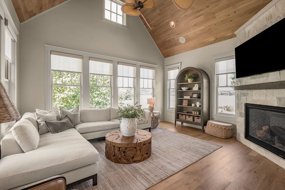
Embracing the serene beauty of the outdoors (inside), the porch at Fox Hollow underwent a stunning transformation. We adorned the ceiling with the same inviting wood found in the entryway, creating a seamless transition between spaces. A new fireplace, adorned with striking stone, becomes the focal point, while carefully selected furniture invites complete relaxation.
Powder Bathroom: Tiny But Mighty
Even the smallest spaces deserve to shine, and the powder bathroom at Fox Hollow is no exception. Here, we introduced a new white oak vanity, a perfect marriage of form and function. We adorned the walls with peaceful wallpaper and accented with new hardware, lighting, mirrors, and art. This space is a testament to the transformative power of attention to detail.

Owner’s Bedroom: Tranquil Retreat
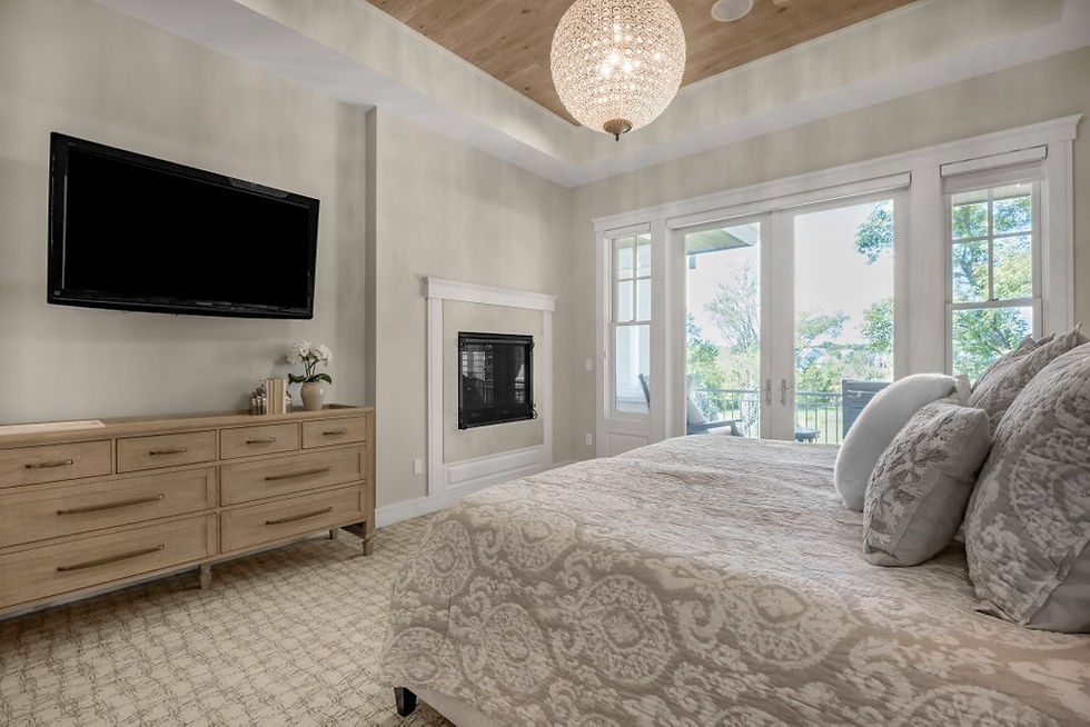
The owner’s bedroom at Fox Hollow is a tranquil retreat designed for rest and rejuvenation. Continuing the theme of warmth and sophistication, we installed wood on the ceiling, infusing the space with cozy charm. We completed the room by adding in some lush new bedding that takes comfort to a whole new level, inviting our client to snooze in style and total bliss.
Owner’s Bathroom: Refreshing Serenity
Last but not least, we spruced up the owner’s bathroom to make it feel like a mini spa. Painting the cabinets and walls provided a clean canvas for a subtle yet impactful transformation. New mirrors, faucets, hardware, and accessories add a touch of luxury, creating a sanctuary where the stresses of the day simply melt away.

At SMI, every design decision is made with the client’s vision and lifestyle in mind. From the welcoming embrace of the entryway to the serene sanctuary of the owner’s bathroom, each space tells a story of timeless elegance and unparalleled comfort. This main floor remodel stands as a testament to the transformative power of interior design, where every detail matters and every space has the potential to become a masterpiece. We're all about making your design dreams come true. From the moment you walk in to the moment you go to bed, every inch of this place screams "you".


